Assignment 08
This is an example dashboard from the Data Visualization class Github. My plan for my final project dashboard is to use this storyboard style over the rows style because I believe it presents a stronger narrative flow.
From the flexdashboard example projects I plan to use the ggplotly: ggplot2 goems example as a baseline to expand from and showcase the group’s visualizations.
While this assignment focuses on planning for a dashboard, please see the Final Project Storyboard tab for my use of the flexdashboard and ggplotly.
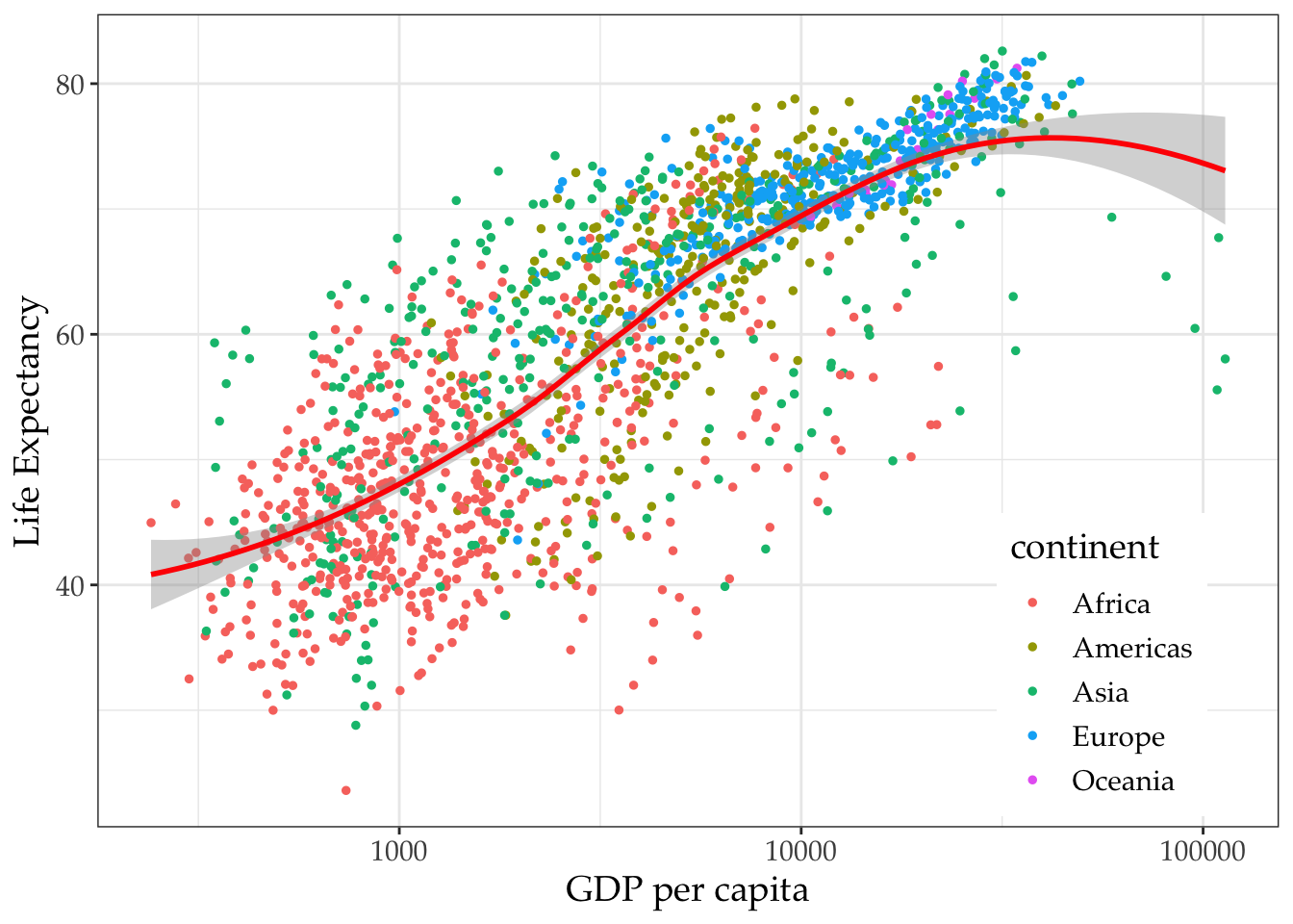
Gapminder is based on the Gapminder data, showing the life expectancy, population, GDP PC data, etc.
This is a sample dashboard design based on flexdashboard sample layout (storyboard). More detail can be included in the sidebar (note the asterisks above the text), explaining the data in chart. Markdown codes can be used for giving narratives to the charts/demonstrations.
Happy Planet Index
library(rbokeh)
hpi2016=read.csv("https://raw.githubusercontent.com/datageneration/datavisualization/master/data/hpi2016all.csv")
figure(width = 800, height = 600, legend_location = "top_left") %>%
  ly_points(AverageLifeExpectancy, HappyPlanetIndex, data = hpi2016, color = Region, glyph = Region, size = 5, hover = list(Country, GDPPC))
Happy Planet Index data are presented here. This is to demo the story of the chart created using bokeh.
Leaflet
An interactive map usiing leaflet or mapview can be used here. Instructions of using the map can be loaded here.
Base plot
library(RColorBrewer)
plot(pressure, pch=20, col = "firebrick")
This is a simple base plot.
D3_Chord diagram
knitr::include_url("https://observablehq.com/embed/@d3/chord-diagram?cells=chart", height = "600")External content can be loaded here: in this case, a D3 object/chart.
D3 Laddar Graph
knitr::include_url("https://karlho.github.io/D3/lg_twclimate/index.html", height = "600")You can load your apps or project works here.